top of page
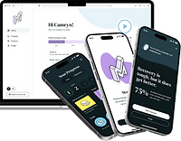
Healthcare Mobile/Web App
Responsive application helping cancer patients using a therapeutic device for treatment

Overview
Over the course of three months, I worked within a global, interdisciplinary team to design a mobile app and responsive desktop application for a client in the healthcare industry. I collaborated daily with a smaller design team consisting of two senior UX designers and an experience consultant, who served as our team lead. As the project progressed, I partnered with business analysts to design additional screens to address requirements ahead of sprint planning sessions. I also regularly presented designs to client stakeholders, gathering feedback to ensure alignment with their needs.
The Team
-
Experience Designer (me)
-
Senior Experience Designers
-
Experience Consultant
-
Business Analysts (BA)
-
Client Stakeholders
-
Developers
Tools
-
Figma
-
FigJam
-
Stark Contrast and Accessibility Checker (Figma Plugin)
The Problem
The purpose of this project was to support cancer patients using a therapeutic device for treatment. The mobile and desktop applications aimed to provide device users and their caregivers with portable information about their device, allowing them to track usage and troubleshoot errors. Additionally, the app aimed to serve as a quick reference, offering answers to frequently asked questions without requiring users to contact a device support specialist. The project was particularly impactful because the previous methods for accessing this information involved navigating the client’s extensive website or contacting support, which could be frustrating and time-consuming.
Goals and Objectives
As with every project I work on, I approached the problem with a user-centered mindset. This project presented a unique challenge because the target audience included older individuals with dexterity, memory, and vision impairments due to their medical conditions. As a result, I committed to learning more about accessibility and how to create a simple solution requiring minimal cognitive or physical effort. A key focus was on minimizing user actions, such as clicks and taps, and ensuring that the design was simple, intuitive, and easy to navigate. Another consideration was creating scalable and reusable designs, as the client intended to leverage them for a future project.
Addressing User Needs: Dexterity, Memory, and Vision Impairments
-
Minimize clicks
-
Prioritize simplicity, intuitiveness, and accessibility
-
Maintain design consistency and scalability for future projects and varying screen sizes
The Process
Visual Exploration (Pre-Kickoff)
In the first few weeks of the project, another designer and I worked independently to design wireframes for various possible mobile screens. We met daily to share feedback and refine our designs. Our goal was to prepare screens that could be presented to patients in an early round of usability testing. The challenge at this stage was prioritizing the most important screens to complete prior to testing.

Low-Fidelity Screen Designs
Alongside wireframes, we created stylescapes to explore various client brand colors, typography, and button shapes. These early explorations provided valuable insights into users’ preferences and visibility needs.

Stylescape 1: Secondary Brand Color

Stylescape 2: Dark Mode Option
The client shared insights from the initial usability testing sessions with the internal team, which revealed a key point; what makes something “intuitive” may differ across various audiences. Moving forward, it became important to explore other data visualization methods and to use less technical language. Additionally, I learned that I may have to embrace atypical design patterns and prioritize higher contrast because users noted that the card components blended into the background too much.
Research Findings
-
Confused about the meaning of the donut chart
-
Wanted clearer language for better understanding of device errors
-
Expressed interest in customizing date ranges for viewing usage
-
Appreciated separation of appointments and events
-
Highlighted the need for high contrast between content areas and backgrounds to indicate clickable areas

Strengths and Weaknesses Based on Research Findings
Ideate-Iterate-Implement
Following the first round of usability testing, the rest of the project followed a similar structure of ideation, iteration, and implementation. Each designer focused on different features, starting with mobile screen sizes before translating them to desktop. Before I started any designs for a new feature or piece of functionality, I gathered reference images, noting what did and did not work well before creating several mockups. To ensure the cleanliness of my work, I pulled from existing elements in our design library and created new ones as needed. I refined my designs by narrowing down options and iterating based on feedback from the design team, stakeholders, and business analysts.

Ideate-Iterate-Implement Workflow
Calendar Feature
Over the course of this project I came to receive ownership of several features. The first feature I completed was the calendar, which contained appointments and events. In revising my initial designs, I wanted to make it clear which actions the user could take on a page. I also wanted to create a structure that would be adaptable if some appointments or events had a lot of information or had missing information.

Calendar: Before and After
Once the calendar designs were reviewed by the team of business analysts, I recognized the need to account for all scenarios, including entire and partial empty states. This was an important lesson in anticipating edge cases and improving documentation for broader team understanding.

Calendar: Partial, Empty and Complete States
Help Feature
Another process I gained ownership of was the help feature. In gathering reference images, I saw the opportunity to not only provide troubleshooting resources, but also educational ones. The client was pleased with my proposed designs, which integrated existing articles and videos from the client’s website into the app and organized them into intuitive categories.

Help Center Design Iterations
In exploring high-fidelity mockups, I started out with an “All” tab and a “Bookmarks” tab. However, I adjusted this after receiving feedback that it would be better to separate the problem-solving resources from the nice-to-haves.

Help Center Designs Version 1
In the final version of the help page, there is a “Troubleshooting” tab and an “Explore” tab containing the various resources and categories I put together. Users can access their saved resources by tapping the star icon, instead of a bookmark icon, because this more closely reflects the icon that users would see when saving a particular website in their web browser.

Help Center Designs Version 2
I also explored what the help article pages could look like. I implemented a share feature for patients and caregivers to share resources with one another. Additionally, there are jump links and a stepper feature to reduce the amount of scrolling required.

Help Article Designs Version 1
Because I wanted to further reduce scrolling in the final version, I made the stepper information accessible by tapping a button instead. Instead of embedding the information directly on the page, I incorporated “Show me how” buttons to reveal the corresponding information.

Help Article Designs Version 2
Usage Feature
The final significant feature I worked on was for usage, which is the primary feature of the app. This screen presented the opportunity to implement a comforting tone of voice through different messaging based on whether a user was exceeding or falling short of their goals.

Usage Low-Fidelity Designs
Through several iterations, I designed a screen that allowed for customized views of users’ daily, weekly, and monthly usage data. This introduced some complexity in the hierarchy, which I addressed through careful consideration of how different selections would impact the layout and user interactions.

Usage High-Fidelity Designs
Desktop Designs
Although we prioritized a mobile-first approach, I also ensured the designs could scale effectively to desktop and tablet views. All of my design iterations were done across mobile screen sizes; therefore, once a design was approved, I could easily scale it up to fit larger screens. The adaptations could be as simple enlarging elements or creating two columns.

Desktop Designs: Profile/Settings and Calendar Pages
The most challenging aspects of adapting mobile designs for desktop was determining how to translate the interactions. On mobile, clickable elements would advance to a new page or open a bottom sheet. On desktop, I had to consider when a modal may be more appropriate than a new page based on the amount of content. Additionally, I explored other interactions like implementing a dropdown menu and compressed tabs to reduce unnecessary scrolling.

Examples of modals across desktop screens
The Results
-
Designed 59 mobile screens with default, active, and empty states taken into development
-
Designed 101 desktop screens with various states taken into development
-
78% of core functionality screens were approved upon completion of my involvement in the project
-
Ensured that all designs met AA compliance standards
-
Contributed to a scalable and reusable design library
Ultimately, this project deepened my appreciation for the impact of accessibility for users with cognitive and physical impairments. Whether I was focusing on interactions, page layouts, or design library components, I consistently prioritized accessibility, scalability, and reusability— all while ensuring the solution met client needs.
Explore my other case studies!

bottom of page